SPEAK THE SAME LANGUAGE
TO CALL OUR TARGET´S ATTENTION
- Content
- Print Design
- Social Media
- Web
2014 – 2016
BRIEF
One of the hardest thing for a student is choosing a major. It brings greatest uncertainty for the future students
Between social and family pressure. High expectations regarding their professional future and the amount of information available in various media. This decision becomes something that steals several hours of sleep from young people.
Thinking about the students and how difficult this moment in their lives can be; was paramount to take on a great challenge with the University of San Buenaventura, Bogotá. We had to re-design and set up a digital ecosystem that would allow us to get closer to those who are about to start their professional career, and to strengthen the relationship with students, graduates and other members of the community.
OBJECTIVES
- Optimize the digital contact points to establish constant communication with users.
- Design a digital experience to provide community members with access to all the information fast.
- Attract potential users through relevant content.
- Learn the language and slang of current and future students to get closer and know them better.


PLANNING
STOP TALKING TO YOURSELF! SPEAK TO THE AUDIENCE IN THEIR OWN LANGUAGE!
Knowing in depth the reality as well as understanding the way the school works, its strengths and also its weaknesses, our client and its users was key.
Three months of hard work with the school´s communications department allowed us to fully know their programs, their processes and the goals of each unit within the institution.
We asked the aspirants about their expectations. The students about their interests and the graduates about their needs. This exercise helped us understood the best way to communicate with all the target audiences.
It was gratifying to work together and as a result we found that the university should stop talking to itself and start interacting with its users.
OUR PLAN IN ACTION
New Website
Finding information in the university’s website was a complete odyssey. That is why users clicked away quickly.
After our planning exercise, we designed the architecture of the new site. We created the navigation flow for each kind of user responding to their specific information needs.
The academic programs should attract the user instead of confusing him. That’s why we simplified the language and the we centered our communications in their interests, hobbies, abilities and dreams. Providing important guidelines so they could discover their true passion.
WEB SITE



SOCIAL NETWORKS, A COMMON PLACE
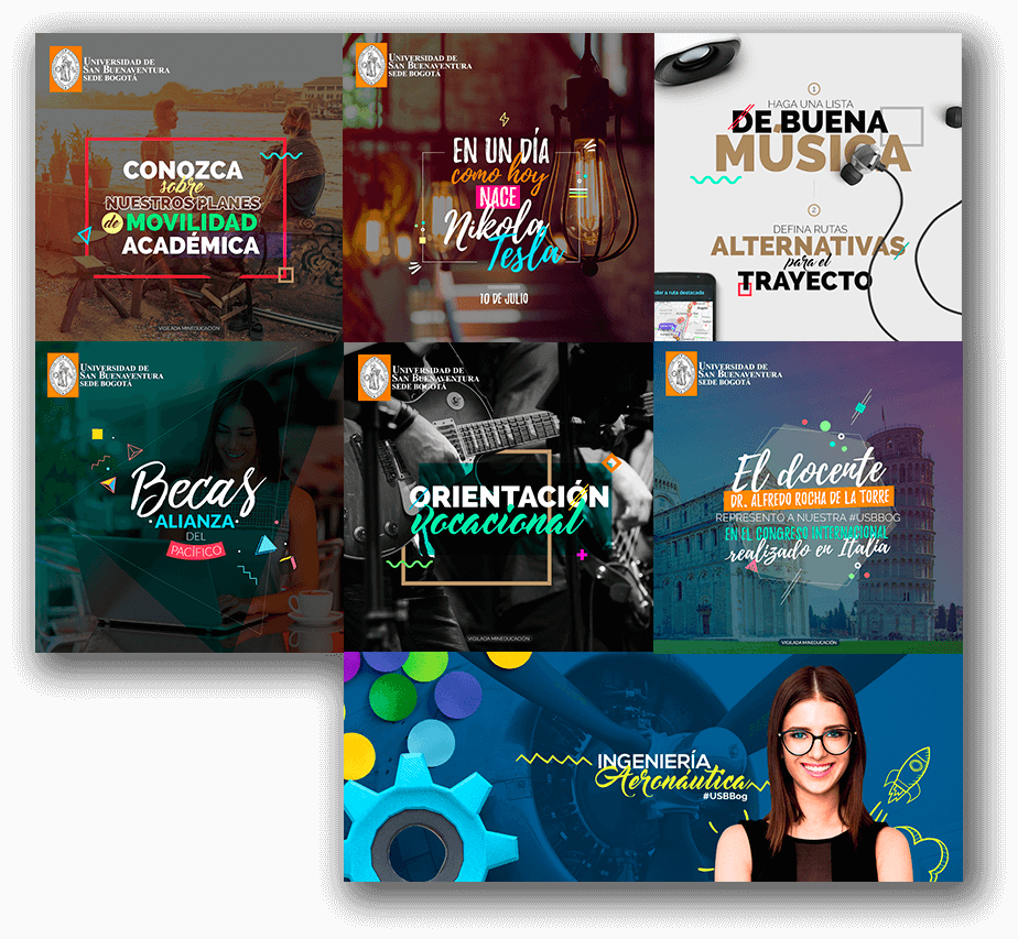
Communicating in their own language was not enough! we had to get to them. We took all this strategic work and the new language of communication – visual and written – to the social networks in which we would surely find them: Facebook, Instagram and Twitter.
Every month we created content grills with relevant information divided in percentages that were consistent with the University´s objectives. We communicated important events and dates. We shared interesting and fun topics. We dedicated ourselves to get them to smile.
At the same time, we boosted the growth of our community through AdSocial tactical campaigns, connecting more users with the brand. We added an important number of commercial leads to their databases.
The interaction levels were beyond expected. We became the main communications channel for aspirants, students and graduates. We responded opportunely to users concerns using a warm language that made them feel confident and allowed us to show them their opinion was very important to us.



A COHERENT OFFLINE LANGUAGE
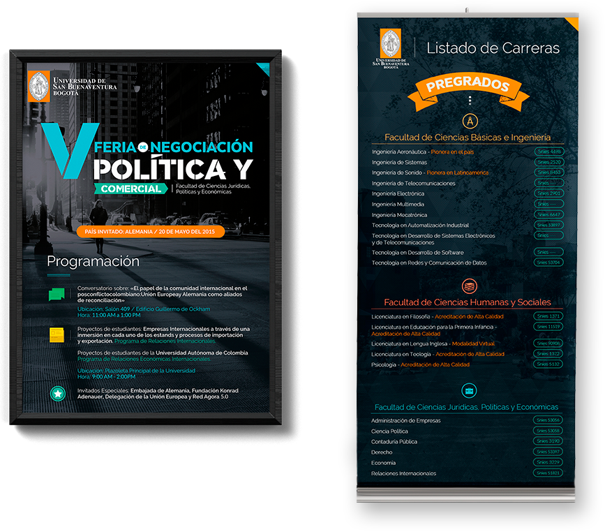
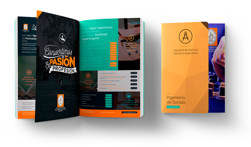
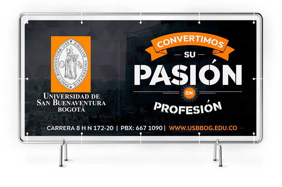
Banners, posters and brochures were the offline extension of our digital communication strategy. Each piece was planned and developed thinking about the user and the information they needed to access.
POSTERS AND BANNERS
MAGAZINE AD – BROCHURE
BILLBOARD
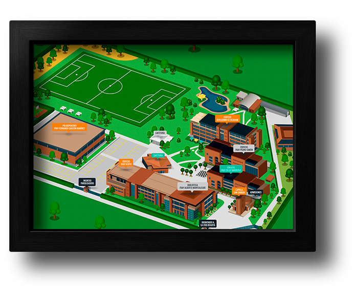
ISOMETRIC ILLUSTRATION






A video is worth a thousand words
Days of recording in campus. Animation and editing in our studio, resulted in the generation of audiovisual pieces as support. We recorded in campus and edited and animated in our studio. We produced several videos for various campaigns. Institutional Accreditation, Tutorials, Institutional Benefits for Applicants and video Wall for Expoestudiantes and many more.
INSTITUCIONAL VIDEO
INSTITUCIONAL VIDEO
Enrol tutorial
INSTITUCIONAL VIDEO
Institutional accreditation


